
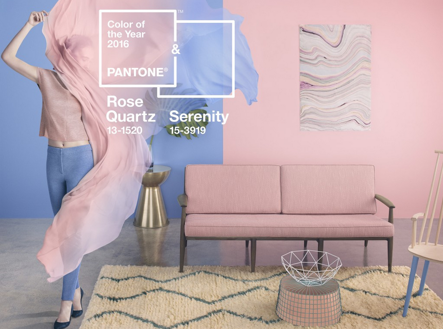
It’s twins! Two shades blended for the first time ever.
Pantone has announced its 2016 Colour of the Year – and it’s a curveball. For the first time ever, the global colour authority has picked a combination of two for the year ahead: Pantone 15-3919 Serenity and Pantone 13-1520 Rose Quartz.
According to Pantone, 2016’s combination is “a harmonious pairing of inviting shades that embody a mind-set of tranquillity and inner peace.”
The announcement, today, is an annual event that’s closely watched by pundits across the design and fashion industries. You can expect a cascade of products in these colours from designers and retailers over the following 12 months.
Pastel pairing
“As consumers seek mindfulness and well-being as an antidote to the stress of modern day lives, welcoming colours that psychologically fulfil the yearning for reassurance and security are becoming more prominent,” says Pantone.
“Weightless and airy, like the expanse of the blue sky above us, Serenity comforts with a calming effect, bringing feelings of respite and relaxation even in turbulent times. Rose Quartz is a persuasive yet gentle tone that conveys compassion and a sense of composure.”
This article is from Creative Bloq