A breath of life for the Guinness Harp
Today it can be quite rare to see a logo rebirth in which the final result is an improvement. London-based agency Design Bridge was tasked “to breathe life back into the Guinness harp and let it sing once again…”. What they come up with is quite impressive, below is some info from Stocklogos about the change.
Many of the posts here over the last few years have lamented ill-advised rebrandings and logo “refreshes” in which the life was sucked out of venerable brand identities, typically via a mindless shift from serif to san serif typefaces and a brutal “simplification” of a design, with thr objective often seeming little more than to cram it more easily into the tiny porthole of a social media icon. Has graphic design been reduced to this sad graphical lobotomization? Happily, not always, with a case in point being London-based Design Bridge’srecent tuning of the Guinness logo.
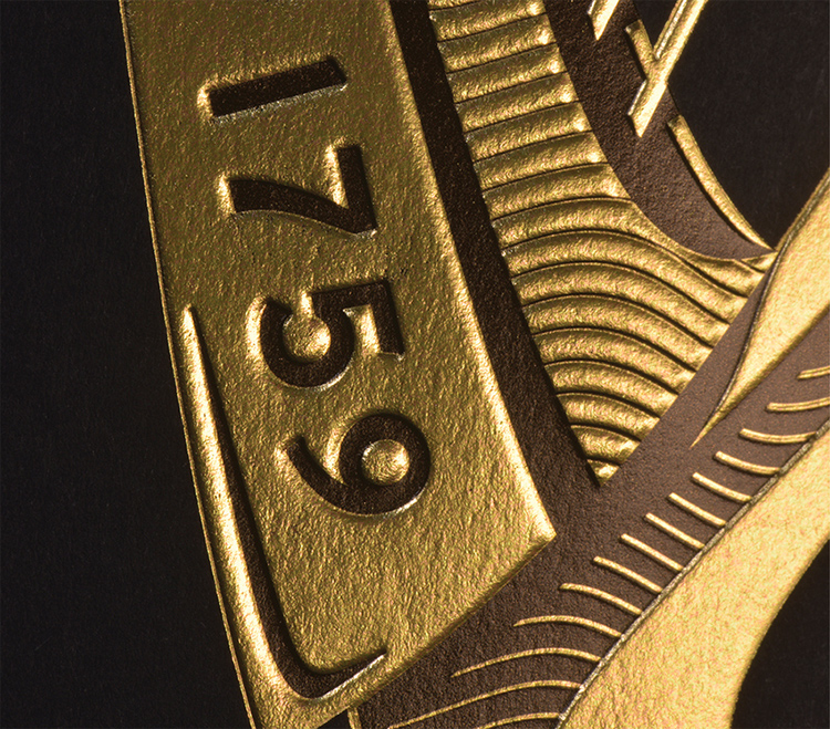
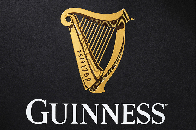
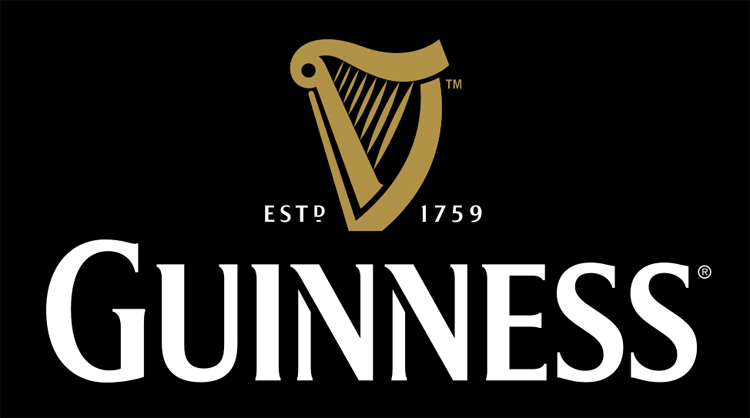
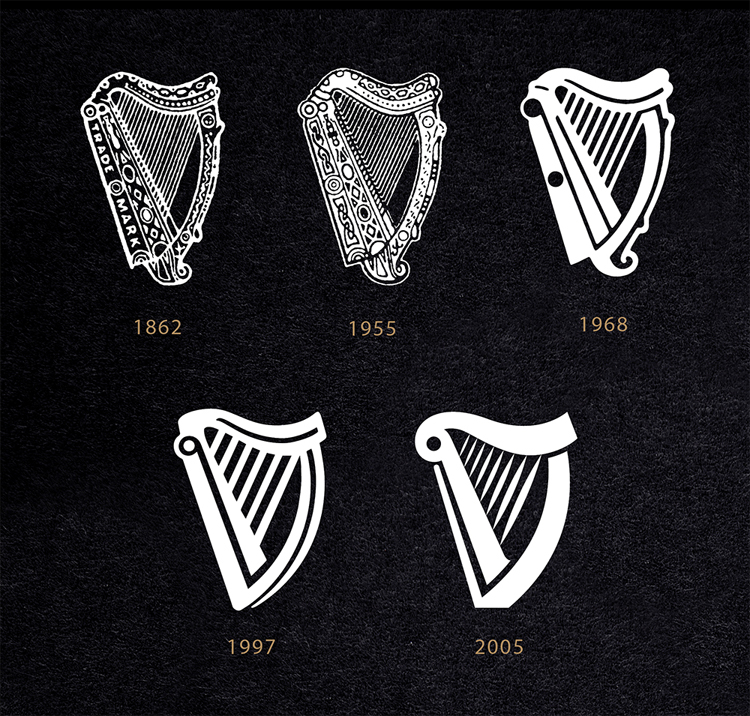
If you’re a teetotaler, the Guinness name may be unfamiliar to you. It’s the brewer of a unique Irish dry stout beer that’s available in over 120 countries, totalling an impressive 1.8 billion US pints. A big part of the Guinness appeal is its history, which can be traced back to when founder Arthur Guinness launched his brewing enterprise in 1759. A celtic harp, a symbol closely identified with Ireland’s identity, had long been the central element in the logo but had become progressively simplified to the point where it had lost its power. Below is the version introduced in 2005, followed by earlier iterations. As you can see, the harp had been progressively stylized over the years, to the point where it had become an almost abstract shape.
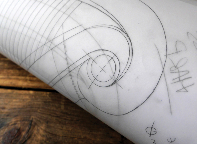
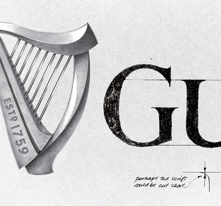
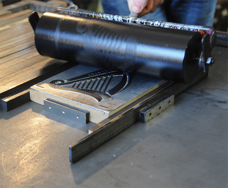
Design Bridge was apparently tasked “to breathe life back into the harp and let it sing once again…”, a process it began by spending time with harp makers and working with Gerry Barney, who in 1968 had created a version of the logo and accompanying type, based on old Guinness advertisements and labels. The firm then experimented with various letterpress techniques and eventually created a harp with a dramatic sculptural presence, enhanced with old engraving-like textures. This was reflected by keeping the distinctive look of the two capital letter Ns in the wordmark but shifting to a fully serifed treatment and dropping the tired stretched effect. Result? If it can be said that perfection can be reached via a logo refresh, this may be as close as we’ll see for some time to come.